
Website Style Guide content examples
Website Style Guide
Welcome to our home-made guide specific to the Murray Bridge Council website. This is a living page and we will update it frequently. Please let us know if we need to clarify any instructions or if you find a better way to do something!
We will start with this page with some best practice and tips and tricks. Click on any of the below links to whoosh straight to the content (These are called anchors and you can learn how to do these too).
- Headings
- Fonts
- Spacing Tricks
- Anchors
- Avoid bringing in superfluous code and how to clean text
- Language, tone and keeping your web page content relevant
- Best Practice
You can also check out the LGA guides here (you will need your Squiz login):
- https://lgasa-web.squiz.cloud/_guide – for how to’s
- https://lgasa-web.squiz.cloud/_uat - for examples
- If you need help
- To give feedback on any web pages you want changed
- To give feedback on this guide
Content Containers
As we work through this page we will show examples of types of containers and when best to use them. We will be covering our most used containers/components:
This is a plain content container using no template and the type is WYSIWYG which stands for 'What you see is what you get'. We use this container for text only. This is good if you need some text before a container, like a little intro blurb or in between containers.
When a new page is created it will have a plain content container ready to go as a default. To insert a content container like this one click on the + symbol above the container and choose the template you would like to use. In this case the template is --None--.
Here is a link to the LGA examples of containers/ components
Headings
Below are some examples of headings. To select a heading, highlight/select the text you want to use and then click on the H symbol in the tool bar. Select which heading you would like to use. Headings will always show in capital letters and in Murray Bridge teal.
Heading 1- use this only once at the top of the page
Heading 2- use these if you need sub headings. These are used a lot. Probably best if you stick to 3-4 of these on a page
Heading 3- use these if you have many sub headings.
Heading 4- these headings are a lot smaller. Think about the page user and content and if people who have vision impairment might be trying to access the information on the page use a larger heading.
Heading 5- smaller again
Heading 6- this heading is smaller than the regular font and should be avoided
Fonts
There are no font choices on the website, however you can bold and use italics.
Do not use underline or strike-through.
Font size is mostly consistent throughout the website. Sometimes old code can effect the size, see below on how to clean it.
Bullet points, numbered lists, justification, and indentation work the same as in Word.
Spacing Tricks
Sometimes you will be trying to put a space between paragraphs and it becomes too large a space or it doesn't stick or the text jumps back to the previous line. It is not logical but tends to happen when altering older content that has been brought across from the old website rather than when you are creating a new page.
Some tricks to use include:
- Try holding the Shift key and enter
- Try holding the Ctrl key and enter
- Try hitting enter at the beginning of the new paragraph or at the end of the former paragraph
- Try hitting enter twice at the end of the paragraph and then clicking on the beginning of the new paragraph and backspacing twice
- If all else fails ask for help and we will try in the admin of the website
Anchors
The Anchor ID tool allows you to insert an anchor or destination point within the content of a page. These anchors can then be linked to, enabling quick navigation to the content within your Site. For example, you could create links at the top of a page to each separate section of content within that page. You might consider using an anchor is you have a page with a lot of information on it and you know that people will want to skip to the info that is relevant to them.
LGA instructions are kept here.
The cool thing about this link here is that it also can help you go straight to the text in the middle of the page- this is the destination point. This can also be achieved using the same instructions.
Avoid bringing in superfluous code and how to clean text
Sometimes if you have copied and pasted from a web page or a word document you bring old code with you. This may alter the way the text is displayed on the website including the size.
If you need to clean away the previous code stuck to your text select the text and use the broom in the toolbar above to clean it.
It is good practice to use clean text whenever you can so you can compose your draft copy in either notepad or word before using it.
Language, tone and keeping your web page content relevant
The language and tone of the website is the same as any council document made available to public. For guidance see Council's Social Media Guidelines here
This means that we must consider:
- Confidentiality and safety of Council or the public's information
- Consider cultural sensitivities
- Do not use copywritten images
- Ensure accuracy and only stick to the facts
- Use appropriate language - do not use discriminatory or offensive language
- make sure that any third party links are also in line with this guide
- Consider accessibility i.e for people with English as a second language, and people with vision impairment.
Unless you intend to review your web page regularly please avoid using date sensitive language i.e last year, next year, next week, this week, due to be completed by, recently, etc.
If you must refer to dates you might set a reminder in your calendar to review your page annually or monthly.
Best Practice
Best Practice tips for consistency, accuracy and a tidy working environment
Planning: Before you start make sure you have planned:
- The text, what you would like to say- significant changes may require approval
- What images you would like to use- upload these first
- The format- what content containers would you like to use
- Save anything you need from the original page in case you need to revert to it
Hyper Linking: Select the words you'd like to hyperlink and then choose the linked chain image in the tool bar. Paste the URL in to the URL section (pasting is better for accuracy). Always select 'open in a new window'. Then choose insert link and make sure that you save the page.
- Hyperlinking to external websites- always open in new window. Make sure the website you are linking to is appropriate to Council. Set yourself a reminder to check that the link is still live- as external web pages are sometimes retired or broken. In some cases it might be better not to link to a very specific page, and instead link the the home page of the website.
- Linking to Internal web pages- the same instructions as above however you must use the asset number of the page you are linking to- this is in case the web path changes. If you select the asset you can be sure it will always be the most up to date version of the asset.
Assets: as mentioned above in the hyperlinking section, assets can be linked to from many places. It can be a page that you do an internal hyperlink to. You can also have an asset be the child to other parent pages. This is good for controlling one source of truth- and if you update the asset it is updated everywhere on the website.
- You can find out where the asset is linked to and add new link by clicking on the linking section in the top bar. This is also good if you want to see where the asset is referred to elsewhere on the website.
Consistency of pages: have a look around the website to get a feel for:
- How pages are formatted.
- Think about how much information you are trying to convey on the page and whether this will need to be broken up visually.
- Before you create something new, do a search first to check that it doesn't already exist
Consistency of naming images and documents: Consistent and descriptive naming of files, captions and titles is not only good housekeeping, it helps other users to locate resources and keep items fresh and relevant.
- Sometimes images and documents will have their name or caption displayed on the website.
- Check first how any other existing resources are named and stay consistent.
- Use consistent and descriptive naming when storing images and documents in the resources section.
- Often the naming you have used in S drive in AA/all photos is appropriate- this also helps us to find things in S Drive.
- Thinking about naming over time- sometimes its best not to have the date on something
Uploading and Storing Resources: resources are images, pdfs, word documents and resuable files (used for tabs and accordions).
- It is very important that resources are stored in the resources section and not up in the webpage folders.
- The resource section is ordered as closely as possible to how the web pages are organised but there are some exceptions.
- If you don't know where a resource should be stored, check to see where similar resources are saved.
- If you have done all of the above and you still don't know where to store something, you might need to create a new folder to store things in- seek advice from the comms team before doing this. If you are in a hurry go ahead and do it and we can move it later.
- Make sure your images and documents are correctly sized for web- less than 1 or 2 mb.
Housekeeping: Reuse, Recycle, Repurpose or Delete
- Check first to see if what you are trying to create already exists. And if it does, see how many places it is linked to and if changing it will effect the purpose, context and meaning of the asset.
- Try to be as frugal as possible in creating new assets and resources.
- If you are updating a resource, say annually, save over the top of the old one rather than creating a new asset
- Tidy as you go. If something is absolutely out of date and will never be used again inform the Comms team and we will delete it.
- If you see something that needs fixing while you are on the website, inform the Comms team.
Log out: Log out of Edit (not edit mode, log out completely of Squiz) when you have finished editing so that others can access the page to edit if needed.
Mobile: We know that around 40% of views on the website are done on a mobile or tablet device. You can see how your page looks on a mobile by clicking on the preview on the top bar and then clicking on the little mobile symbol.
Accordions
Below you can see an accordion. Click on the down arrow on the right of the bar to expand the contents. Instructions on how to use accordions are here.
This is an accordion. It is great for displaying large amounts of specific information.
You can have the frames open independently, and you can have the first frame sit open as a default.
In this accordion we have chosen a read more button- this can go to another page internally or externally. In this case the read more button goes to the LGA examples page for accordions.
Sometimes you might need to have more than 5 accordion topics- which is the limit. If this is the case you can create a folder in the reusable content section and at the top of this container put the asset number of the folder in the dynamic content section. In that folder you can create or link pages.
Accordion containers only hold a medium amount of information and sometimes they can chop info off at the bottom if you've put too much in. About 3/4 of an A4 page fits best. If this is the case, consider breaking up the information- and if this is not possible, an accordion might not be the best option for your information.
Tabs
Below you can see tabs are used. You can see instructions on how to use tabs here.
- Tab heading 1 and intro Tab heading 1 and intro
- Tab limitations Tab limitations
- Tab 3 examples Tab 3 examples
Tabs are great, they are similar to accordions for displaying medium chunks of specific information. They are best used for under 5 topics.
They are good for FAQs.
You can only use text in tabs, no images, no fancy buttons- but you can still use hyperlinks.
Tabs don't cut off long amounts information at the bottom, but you still want to be mindful of how this will look on the page and whether tabs are right for the size of the information you want to display
Just like accordions, you can use a folder in the reusable folder section if you have more than 5 topics but this doesn't look great on the web page.
Here is a link to some examples of tabs in the LGA site
Here is a link to tabs being used on our own site

Feature Panel
Here we have a feature panel. You can have this display as horizontal as it is here, or vertical. This is good for displaying a paragraph or two as a teaser and then directing readers on to another page.
The image is displayed at 33% but you can also go to 50 and 66% in size. You can also choose to have the image display on the left or right of the text.
An LGA example page is here
And an example using our own site is here
Image Gallery
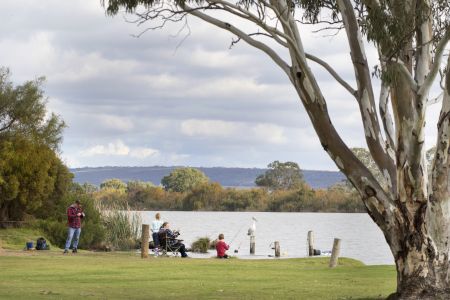
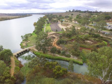
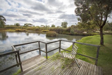
Below you'll see an image gallery that scrolls automatically. To create an image gallery you'll need a folder for your images, you then link to the folder as your source.
Instructions for adding an image gallery are also here. And you can see an LGA example here
Images are best when they are high quality and (add dimensions)
Below is an image gallery we have for the Avoca Dell Reserve. We have the settings to rotate automatically, we have chosen to display captions, image number and to display thumbnails- these are all optional.
If you are using captions make sure they are user friendly, consistent and they credit the artist or photographer if required.



Card Listings
Card listings are for the landing/parent page of a topic. For the card listings to show an image each of the pages need to have a related image on the details section of the page.
You can also have card listings with no images - it needs to be all or none. To select the card listing go to the parent page and insert a card listing content container. Choose your settings and select yes for 'list children under this asset'.
Here are LGA instructions for card listings and here is the LGA example page
You can see one of our favourite card listings below. It is set as a carousel listing but we mainly use the stacked listing so that people can see all the options in one glance. And for the purposes of this online guide, we have had to select the individual pages rather than adding the parent page - this is something you can also do to if you are bringing in information from lots of different places on the website rather than the children of the parent page. It is best to see the card listing as it appears on our site here.




Floated Image
This is a floated image. The image settings are at 25%, the image is set to the left and wrap text is also selected. Using a floated image container is best practice because you have more control of the image.
Here are the LGA floated image instructions and sample page.
That said, if you want the image to be hyperlinked a floated image won't work: instead you can drop an image in to a plain content container using the tool bar above.